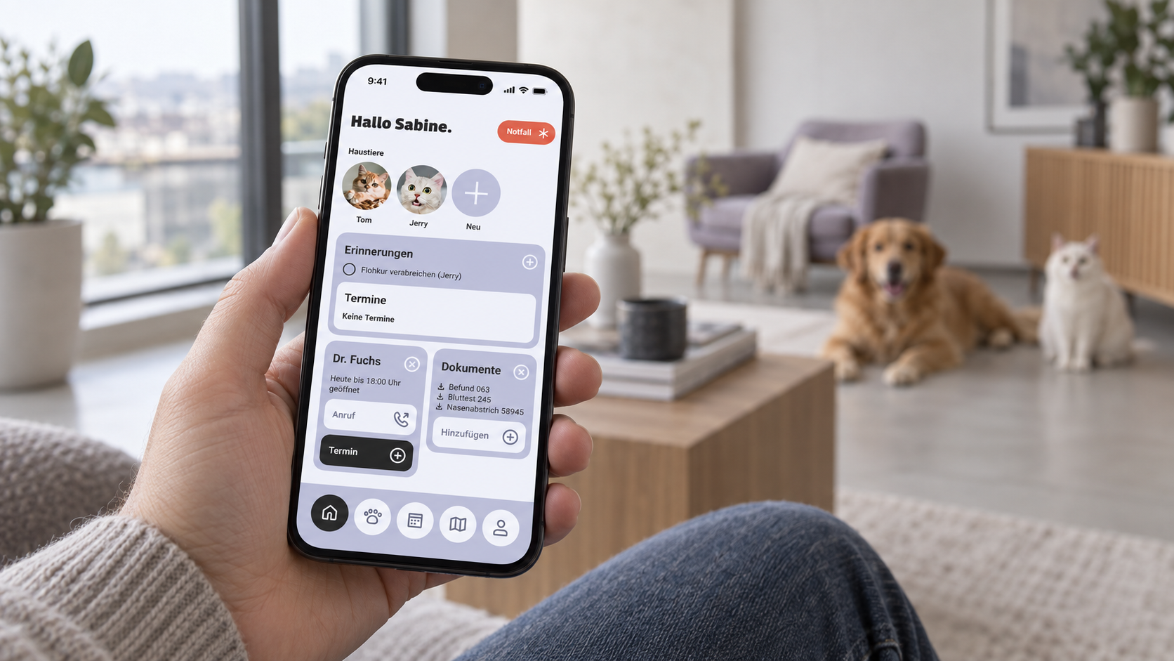
AI-generated usage scene featuring the Pfotenpass app design
Scope
4 weeks · February 2026 · Remote
Collaboration
Team of three · Shared decisions
Outcome
High-fidelity prototype · Bootcamp concept
01 / My contribution
From idea to structure.
We divided the work between us and agreed all decisions together. I took the lead on:
01
Product concept and research
Topic research and competitor analysis
02
Naming and branding
Naming and logo development
03
Features and user journeys
Core features, design principles, user flow and information architecture
04
Organisation and documentation
Project organisation and preparation of the case study
My focus was therefore on the conceptual foundations: what problem should Pfotenpass solve, and how could we turn that into an intuitive digital product?
02 / Research
The information existed. The overview was missing.
Vaccination records, emails, invoices and test results: health information is often scattered across different places. Finding the right details becomes harder when caring for several pets.
An online survey with 30 participants and three qualitative interviews informed our concept. Recurring problems included missed vaccinations and medication schedules, and documents that were unavailable during a vet visit or emergency.
This led to our guiding question: how can pet owners keep track of their pets’ health and manage information in one place with minimal effort?
03 / Focus
The core task defines the scope.
Our research led us to focus on pet profiles, health records, documents, appointments, reminders and vet information. We set aside additional services such as a shop, chat and insurance offers for possible future development.
This prioritisation gave the four-week project a clear scope, centred on managing pet health. I led the definition of the feature set; we made the final selection together.
04 / User journeys
From a need to the next step.
We developed user journeys for two specific tasks:
Completing a pet profile: A proposed scanning feature would import data from an existing vaccination record.
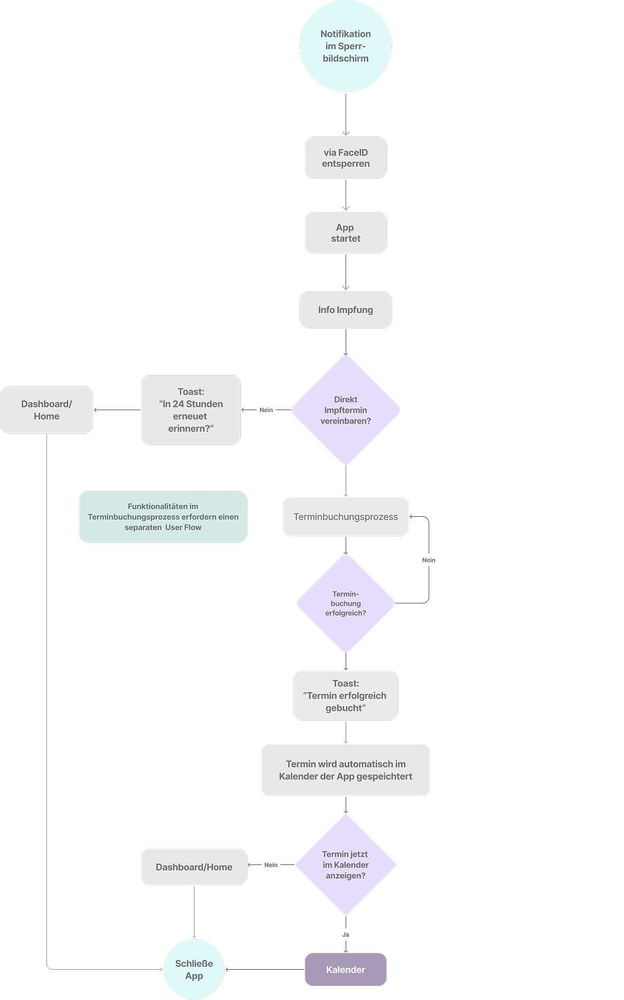
Responding to a vaccination reminder: The proposed journey leads from the notification to booking a vet appointment.
Two complementary views helped us separate structure from the individual journey: the user flow examines a key task step by step, while the information architecture organises the full range of features.
04.1 / User Flow
From vaccination reminder to booked appointment.
The flow starts with a lock-screen notification, opens the app and vaccination information, then leads into appointment booking. Decision points cover a later reminder, booking confirmation and opening the calendar. This clarifies the feedback the app needs to provide at each step.
User flow · Vaccination reminder and appointment booking · Original German diagram · Open to enlarge
04.2 / Information architecture
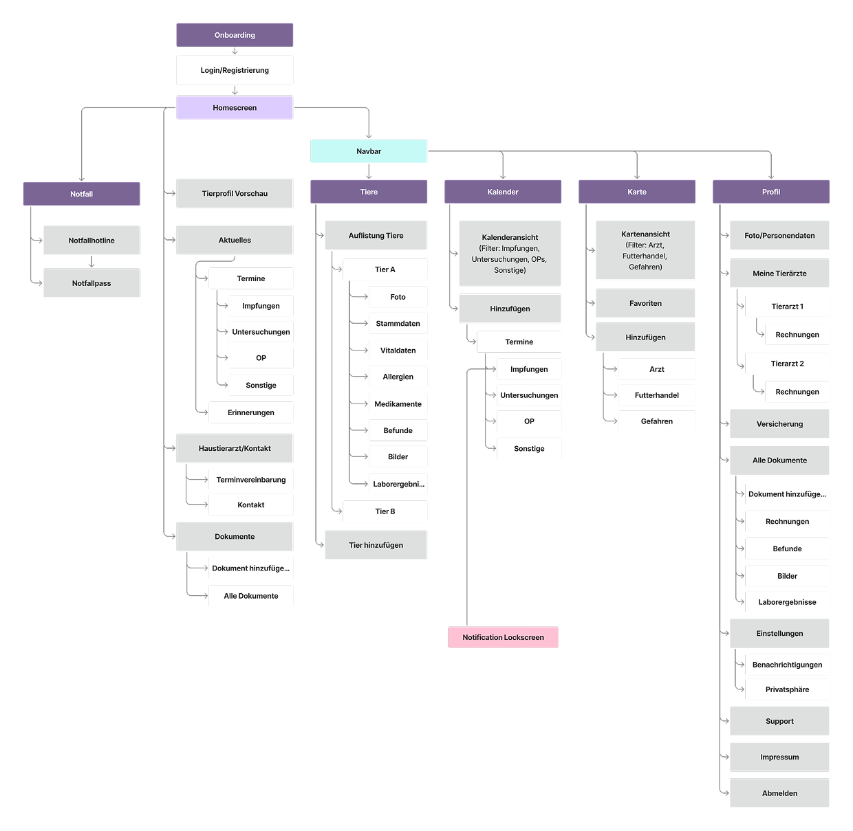
Five main areas provide a clear structure.
Home brings together updates, appointments, reminders, vet contacts and documents. Navigation separates Pets, Calendar, Map and Profile, with emergency features directly accessible. The overview helped us prioritise content and make relationships between features visible.
Information architecture · Full overview · Original German diagram · Open to enlarge
05 / Design
Calm design and hierarchy help people find their way.
“Simple and understandable”, “trustworthy and transparent” and “modern, calm and reliable” were our design principles. They guided a restrained interface with clearly grouped content and reusable components.
The dashboard brings appointments and reminders together. The pet overview organises health information by animal, while the emergency record highlights essential details. We translated the conceptual structure into distinct views, each with a clear focus.
01 / Dashboard
What’s coming up?
Appointments and reminders at a glance.
02 / Pet overview
How is my pet doing?
Health information organised by pet.
03 / Emergency record
What matters right now?
Essential details highlighted and close at hand.
06 / Prototype
Pfotenpass in action.
This 3:22-minute project video demonstrates the prototype’s health information, vaccination entries and appointment booking, among other features. The interface is in German.
Prototype demonstration from the team project · 3:22 minutes
In four weeks, we created a testable high-fidelity prototype, from research through branding and information architecture to visual design. Pfotenpass is a bootcamp concept, not a released app.
The project showed me how closely research, prioritisation and design are connected. The central challenge was to turn many possible features into a well-reasoned focus and clear user journeys.
Usability testing would be needed to establish whether the solution reduces time spent searching and helps people keep track of appointments. The documented research identifies the need; it does not yet demonstrate the prototype’s effectiveness.